The New Science of Meta Static Image Ads: Why Some Images Scale to Millions While Others Never Convert
Most advertisers don’t have a targeting problem.
They have an attention problem.
Every day, people scroll through thousands of pieces of content. Your ad doesn’t compete only with other advertisers—it competes with friends’ vacation photos, viral videos, memes, Instagram Reels, and everything else in the feed.
That means your static image has one job before it can sell anything:
Earn another second of attention.
If it fails to stop the scroll, nothing else matters.
Yet most Meta advertisers still design static ads like posters instead of behavioral triggers.
This article introduces a modern framework for designing high-performing Meta static image ads in the AI era—one built around psychology, visual hierarchy, and attention economics rather than trends or guesswork.
Why Static Images Still Outperform Video
Many advertisers believe video has replaced static images.
That isn’t true.
Videos generate attention.
Static images generate decisions.
Think about the customer journey.
A person watches ten videos.
Clicks one.
But the purchase often happens after seeing:
- A product image
- A comparison graphic
- A testimonial image
- A promotional offer
- A carousel
Static ads compress information into one glance.
When designed correctly, they reduce cognitive effort and accelerate decision-making.
That’s why many profitable Meta accounts still rely heavily on static creatives.
The One-Second Rule
Forget click-through rate for a moment.
Ask yourself:
Can someone understand my ad in one second?
Not five seconds.
One.
Because scrolling is automatic.
If your visual hierarchy isn’t immediately clear, your ad disappears before the brain even begins processing it.
A winning static image should answer three questions instantly:
What is this?
Why should I care?
What’s different?
If any answer requires reading a paragraph, you’ve already lost.
The Visual Hierarchy Pyramid
Every great static image follows a hierarchy.
Not everything deserves equal attention.
Think of your ad like a pyramid.
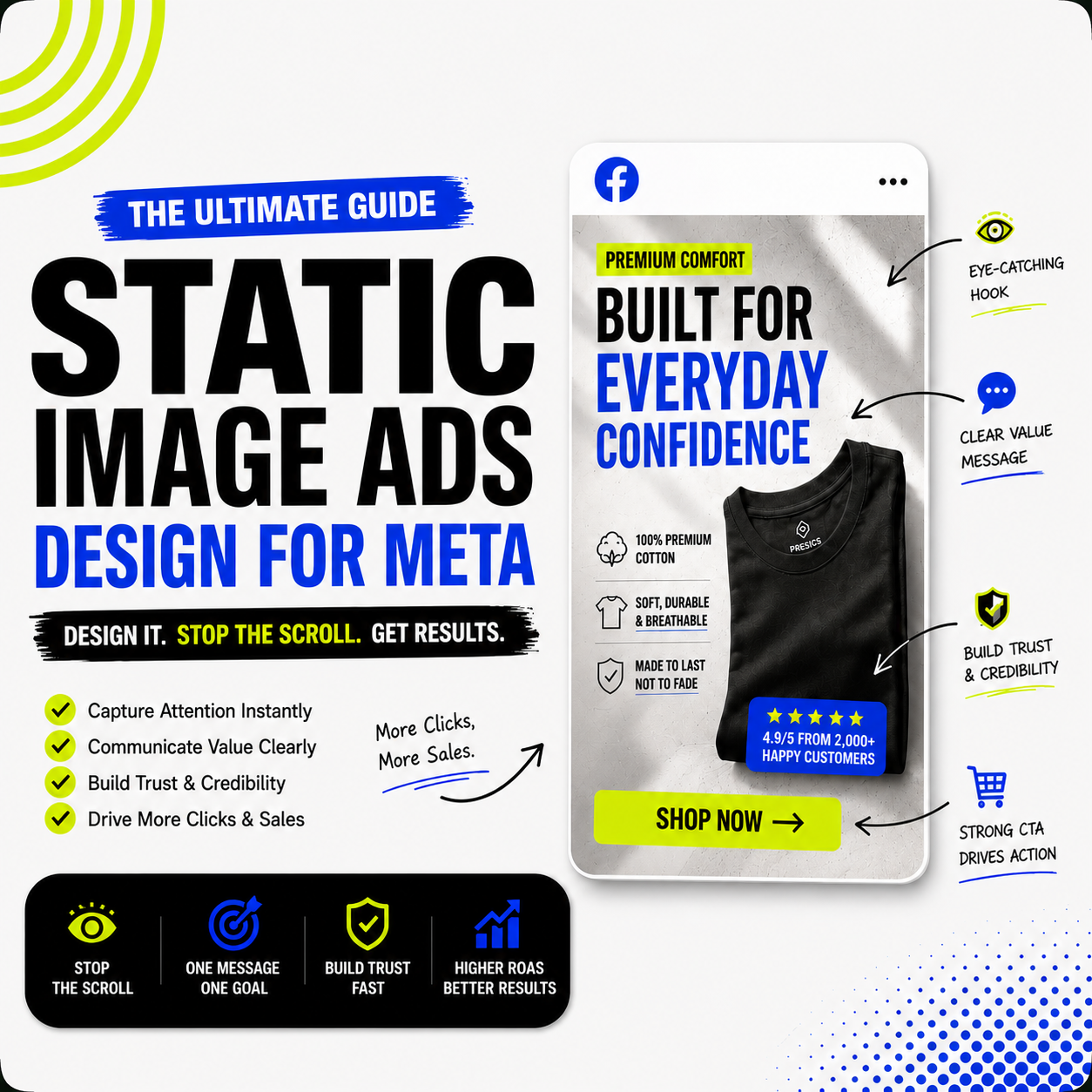
Level 1 — The Stop Signal
This is the first thing the eye notices.
Examples:
- Large headline
- Strong color contrast
- Human emotion (if applicable)
- Unusual product angle
- Bold number
- High-contrast shape
Its only purpose:
Stop the scroll.
Level 2 — The Value Message
Once you’ve earned attention…
Explain why someone should continue looking.
Examples:
- “Heavyweight Cotton That Lasts Years”
- “Designed for Everyday Comfort”
- “Reduce CAC Without Increasing Budget”
This should communicate one core benefit.
Not five.
Level 3 — Supporting Evidence
Now reduce uncertainty.
Include:
- Reviews
- Product certifications
- Social proof
- Before & after
- Comparison
- Feature icons
This builds confidence.
Level 4 — Call to Action
Only after everything else.
Buttons don’t sell.
Clarity sells.
The Single-Idea Principle
One of the biggest reasons static ads fail:
They try to say everything.
Imagine a clothing brand advertising:
Premium Cotton
Lifetime Warranty
Free Shipping
New Arrival
Limited Edition
Best Seller
Sustainable
Australian Designed
Sale Ends Tonight
That’s nine messages.
The brain remembers none.
Instead…
One image.
One message.
One objective.
Your customer shouldn’t have to decide what matters.
You decide for them.
The Eye Flow Method
Most designers focus on aesthetics.
Professional advertisers design eye movement.
Here’s a simple flow:
Hook
↓
Headline
↓
Product
↓
Benefit
↓
Proof
↓
CTA
If the eye naturally follows this path, comprehension becomes effortless.
If users have to search for information…
Performance usually drops.
The Contrast Formula
Attention equals contrast.
Contrast isn’t just color.
There are five types.
Visual Contrast
Dark vs light
Large vs small
Sharp vs soft
Message Contrast
“Most brands…”
“We don’t.”
Emotional Contrast
Pain
↓
Relief
Value Contrast
“$150”
↓
“$89”
Shape Contrast
Straight lines
vs
Organic shapes
Every strong static image uses multiple types of contrast simultaneously.
The 5-Element Rule
Before publishing any static ad, check these five elements.
1. Hook
Would someone stop scrolling?
2. Product
Can I instantly recognize what’s being sold?
3. Benefit
Can I explain the value in five words?
4. Trust
Is there any proof?
5. Action
Does the next step feel obvious?
If one is missing…
Expect lower performance.
The Attention Density Framework
Most ads waste space.
Instead of asking:
“How can I make this prettier?”
Ask:
“How much value exists in every inch?”
High-performing ads usually contain:
- One dominant message
- Supporting visuals
- White space
- Directional cues
- Proof
- Brand identity
Everything has a purpose.
Nothing exists just for decoration.
Design for Peripheral Vision
People don’t read ads first.
They notice shapes.
Colors.
Movement.
Contrast.
Only then do they read.
This means your design should still communicate its purpose even when blurred.
Try this test.
Zoom your design out to 10%.
Can you still identify:
- Product
- Headline
- Offer
If not…
Your hierarchy needs work.
The Pattern Interrupt System
Meta users scroll on autopilot.
Your job is to interrupt that behavior.
Some effective interrupts include:
- Unexpected cropping
- Oversized typography
- Strong geometric shapes
- Negative space
- Tilted layouts
- Bright accent colors
- Unusual product perspective
- Minimal compositions
Not because they’re trendy.
Because they’re different.
Don’t Design for Designers
This mistake is everywhere.
Beautiful doesn’t always convert.
Award-winning doesn’t always sell.
Customers care about clarity.
Not visual complexity.
Simple ads often outperform visually impressive ones because they reduce thinking.
The easier an ad is to understand…
The faster people make decisions.
The Creative Friction Score
Every design creates friction.
Ask:
Can someone understand:
What?
Why?
How?
…without effort?
If they need to zoom…
Read tiny text…
Or search for the product…
Your friction score is high.
High friction lowers conversions.
The Information Layer System
Instead of filling the design randomly…
Layer information.
Layer 1
Attention
Layer 2
Message
Layer 3
Proof
Layer 4
Details
Layer 5
Action
People naturally consume information in this order.
Good ads respect how the brain works.
Why Minimalism Usually Wins
Minimalism isn’t about using less.
It’s about removing distractions.
Every unnecessary icon…
Every decorative line…
Every extra sentence…
Competes with your message.
Professional designers don’t ask:
“What should I add?”
They ask:
“What can I remove?”
A Better Creative Testing Method
Most brands test:
Blue button vs green button.
Headline A vs Headline B.
That’s optimization.
Not learning.
Instead test:
- Different visual hierarchy
- Different emotional trigger
- Different product presentation
- Different background style
- Different message
- Different typography scale
- Different composition
Those tests teach you much more.
The Static Image Framework We Use
Every winning image starts with this structure:
01. Scroll Stop
Create curiosity.
02. One Core Promise
One benefit.
One idea.
03. Hero Product
The product should dominate.
04. Proof
Give the brain a reason to believe.
05. Brand Recognition
Consistent colors.
Typography.
Logo placement.
06. Clear Action
Remove ambiguity.
Repeat this system across every campaign instead of reinventing your designs each time.
Final Thoughts
The best Meta static ads aren’t created by adding more effects, gradients, or flashy graphics.
They’re built by understanding how people process information while scrolling.
Great design isn’t decoration—it’s communication.
When every element has a purpose, every pixel works harder. The headline grabs attention, the layout guides the eye, the product becomes the hero, and the message becomes impossible to miss.
As Meta’s AI becomes better at matching ads with the right people, your competitive advantage won’t come from more complicated designs.
It will come from clearer ideas, stronger visual hierarchy, and designs that communicate value in less than a second.
The future of static advertising isn’t about making ads look better.
It’s about making them easier to understand.